Euro ChalkLettering Tour 2019
These particular chalk arts were made in 2019 to spread the happening of a series of workshops around Spain and Italy. For each piece I was inspired by local references such as architecture, decorative details, visual designs and so on. I had the pleasure to share all my secrets using chalk techniques, different lettering styles and also my creative process with so many people and it amazes me how much I always learn a lot from each experience.

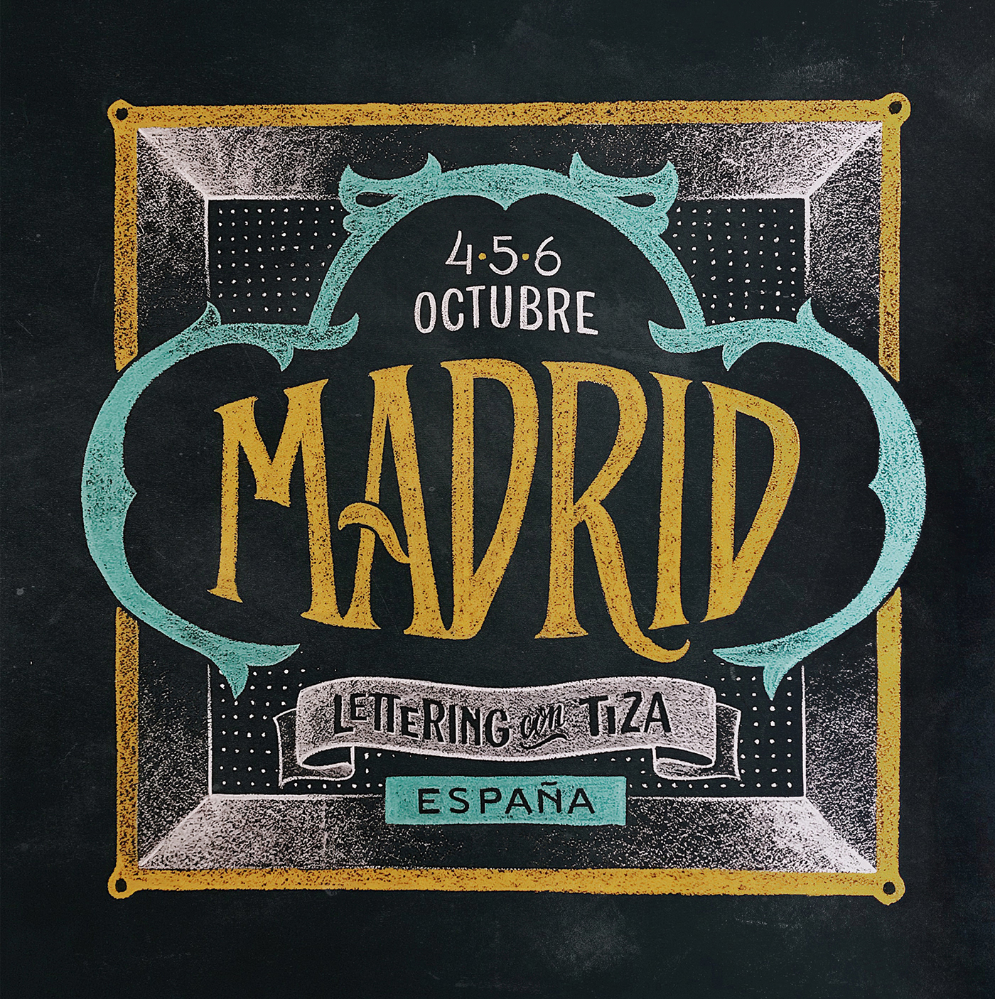
Madrid is full of beautiful shades of yellow and blue. These colours were easy to pick as an inspiration from so many street signs and hand-painted ceramic around the city. Also, the victorian curves and classy style of those typical tiles were perfect to compose this chalk art.

Barcelona is home to some of the world's best art nouveau architecture and I couldn't help but work on some symmetrical floral design for this one. Also, the long city name almost begged me to play with some ligatures between these old modernish letters. I had a lot of fun creating this piece inspired by one of my favorites cities in the world.


And, finally, Turim! Or – in Italian – "Torino" is known for being one of the world's design capital. It instantly reminded me of this amazing designer who is absolutely enthralled with Italian culture: Louise Fili. I was very much inspired by her books and modern art deco designs to draw this piece.


This summer 2022, I'll be teaching in Spain again.
If you're interested, check out my workshop agenda here.

You can also ask me for more information through
my instagram profile.
my instagram profile.


